Although I have work finished to show, I thought I'd wait until I'm a little farther along in the face count before posting. In the meantime, I was going through my closet and unearthed my graphic design portfolio from school. There were some things in there I thought I would share here. Lots of pictures will make this a long post.
This first project was from my typography class. It was called the "single character project". Basically, one character of the alphabet rendered by hand (not digitally) in one of two fonts, either regular or italic, to form a sort of letter collage. The first pic is the jacket of my thumbnails.

And then some larger boards of the rough drafts.


 For the final version of the project, we had to cut all our letter forms with an exacto knife. I chose some art papers that made it tricky....
 Another typography project was the "type personalities project". Four words hand rendered in four fonts that have the personality of the words selected, to form a poster. My thumbnails are below...all done by hand.


Then, the rough drafts mounted on boards. I used a variety of materials...there are even tiny mirrors glued onto the first piece.


 And then a color version of the final project. I must have done twenty different color schemes, then finally turned in the project in black and white for lack of deciding.

Two digital fonts I designed outside of type class...


This next one is a product rendering done for a design class.

There was a lot of drawing done in that class...

 And some more cutting. We had to cut out a design to demonstrate asymmetrical balance, below...
 And another design that had to be cut to demonstrate unity through repetition of shape, flow, and value.
 I had some letters I wrote to my teachers I was going to share. I occasionally wrote a letter about class lectures on the backs of my assignments. I will limit it to one since this post is already so long.
"Insight:
Even if a person were to live their entire life in a constant state of heightened awareness, and he/she were to see all they could possibly see---it would still only be a glimmer of all that there is. So much of the grand design remains concealed, and no one sees the entire work of it from its beginning to its conclusion, from an omniscient point of view. Only the "Author Of Life". The best that there is here, is only visible with the heart and mind, and soul---not the naked eye. Yet the naked eye does provide us with clues to the intangible---all around us, all the time...if a person just sees with better eyes!"
I leave with you with that thought! Until next time, take care!

 I will try to get in some more posts over the week, even with that Sunday night feeling hanging over my head! Until then, take care!

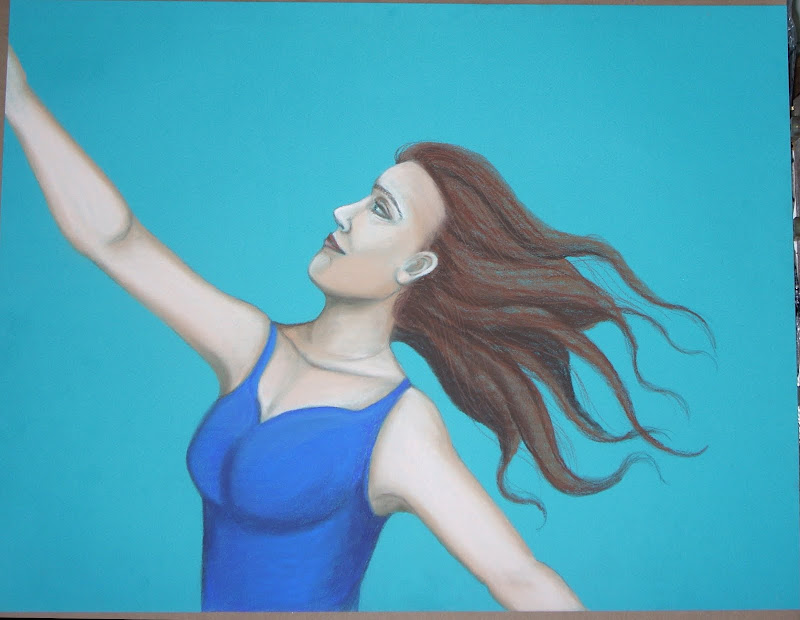
 And below, is a photo of the under painting of the orbs I added to the painting. It was difficult to look at the painting with the orbs like this...I kept telling myself it wasn't finished and to be patient. They were so severe.
 And the finished painting, I am calling "Epiphany", 19" by 25", pastel.
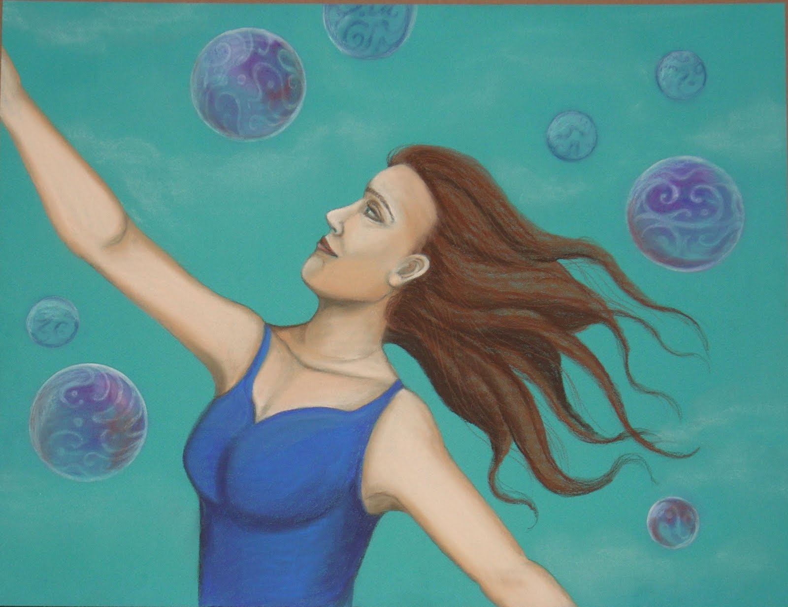 I wish the wispy bits of cloud in the background showed up better in the picture. But my camera flash has the annoying tendency to either bleach everything out, or to accentuate lights beyond their actual appearance. A new camera is on the horizon!
 I really enjoyed making the above pieces. The first one I will probably explore further at some point, with a color rendition. I have two pieces in progress I will try to finish up and post before Saturday. Thanks for visiting my blog, and take care until next time!


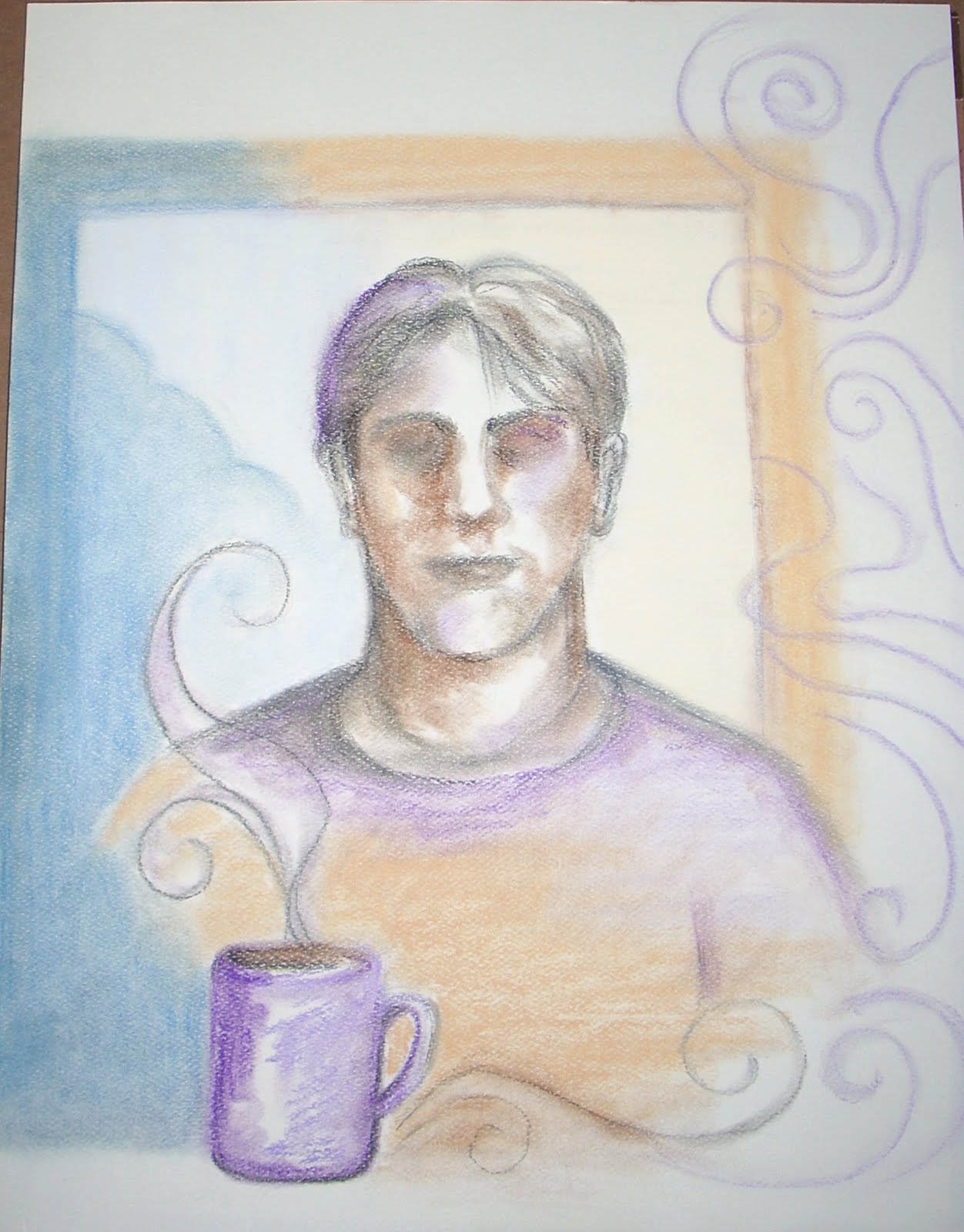
 I also thought I'd post a tentative update of the angel I was working on. I brought the photo of it into Corel Painter and think this is the direction I am heading with it, below.
 Well, that's my weekend post. I will try to post again by Tuesday! Until next time, take care!


 That's all for today. I will try to get a post out over the weekend! Until then, thanks for visiting and take care!


 For the final version of the project, we had to cut all our letter forms with an exacto knife. I chose some art papers that made it tricky....
 Another typography project was the "type personalities project". Four words hand rendered in four fonts that have the personality of the words selected, to form a poster. My thumbnails are below...all done by hand.


 And then a color version of the final project. I must have done twenty different color schemes, then finally turned in the project in black and white for lack of deciding.


 And some more cutting. We had to cut out a design to demonstrate asymmetrical balance, below...
 And another design that had to be cut to demonstrate unity through repetition of shape, flow, and value.
 I had some letters I wrote to my teachers I was going to share. I occasionally wrote a letter about class lectures on the backs of my assignments. I will limit it to one since this post is already so long.
  I hope everyone has been having a great weekend! Until next time, take care!


 Last January, I only had two posts. I hope to have a few more than that this year. January is the "Monday" of all months to me! Hope you are all enjoying the new year so far! Until next time, take care!

