Mission Statement

This is a blog in which I intend to reach my goal to draw/paint a thousand faces! Welcome, and come along for the journey!

Tuesday, May 29, 2012

Rainy Day Painting

Tropical Storm Beryl has dumped quite a lot of rain on Florida. It's good for indoor activities like cleaning house and pastel painting, anyway. A few posts back I mentioned my wanting to do some non-face related pieces, and so I have done some. I thought I would share.


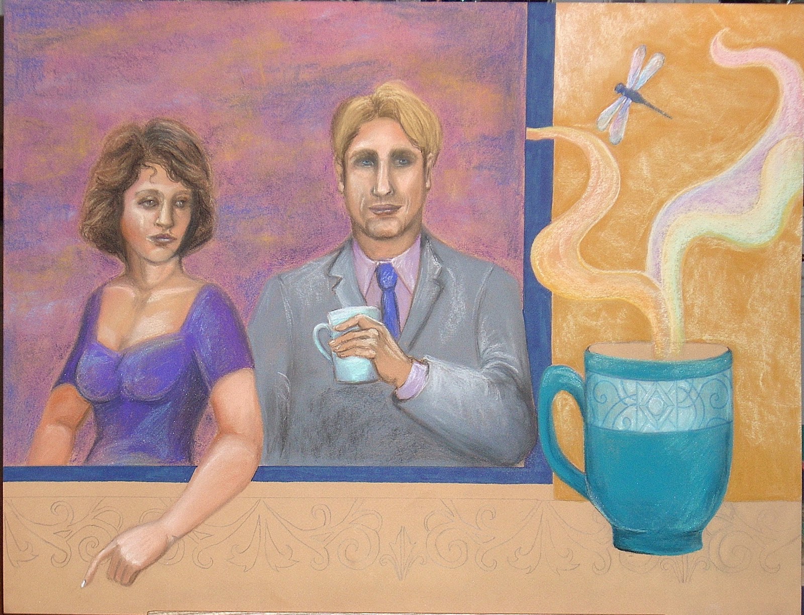
A lot of pastelists are under painting their pieces with watercolor these days. I have been dabbling with under painting limited areas of some pieces with quality colored permanent markers. A person can pretty much decide how much they want it to show through or if they want to cover it up entirely. In these two particular pieces, I'm not sure there was a whole lot of benefit in using it, but I like the ink drawings in themselves before any pastel went on the pages. Just a different look.


With the shells, I actually explored the piece both digitally, as well as with the pastels. I thought of having some custom made fabric printed with the shell design to use for some chair seats I wanted to re-upholster. Not so sure I will follow through, but I may order a swatch, if only out of curiosity to see how this particular Pantone color will print.

Well, that's all for this rainy Tuesday here in Florida. Until next time, take care!


Saturday, May 26, 2012

Faces #602-#608, And Dining Room Re-Do

I'm finally able to get back here to post after being busier than I have wanted to be!

One of the fun things I've been slowly picking at, is a minor dining room re-do. I didn't like the lattice wallpaper border the previous occupants had selected, so off the wall it went. And the dining room chairs that came with the place were not chairs I would have selected myself, nor were they in great condition. I also like the idea of "lightening up" the room for summer. I found four great chairs on craigslist for 15 dollars each, bought a white lace tablecloth for under twenty bucks, and bought a must-have cake pedestal that while not in use I can put candles or shells on top of it. I also bought some vinyl to re-do the seat covers on the chairs, but am not so sure I will use it, now.

Before...

After


I have also been getting in a sketch here and there. Nothing I consider too extraordinary, but at least it's a few more faces...


 Well, that's what I have for now. I hope everyone has a safe and fun Memorial Day weekend!


Wednesday, May 9, 2012

The Latest Development

I would have been able to get more done recently, if I hadn't compounded a pre-existing injury by moving some heavy chairs. It has really slowed me down. Nevertheless; I am grateful that in spite of my yearning to move on from my last piece, that I didn't (partly from being in too much pain). The piece has been sitting on my easel haunting me and I have had a lot of ideas as to how to proceed over the "down" time. Although it still isn't finished, I thought I'd share the update.
I like the direction the piece has taken, and hope to finish soon. Until next time, take care!

Sunday, May 6, 2012

Creating A Harmonious Background

Faces#599 and #600, continued
Some of the choices an artist makes earliest in a painting, may be the same choices they need to follow through with until the end. This seems particularly true when it comes to color and setting an overall tone to the piece. For no other reasons than the characters I drew seemed to have a particular vampish edginess about them, and because I was looking to buy a gazing ball for my front yard; I chose to go with a violet for the woman's dress. (laughing) Now, there. is a whimsical reasoning for having done something! But the ensuing subsequent choices are all based on solid design principles that will correspond to the violet selection. That begins with choosing a cooler gray for the man's jacket, a lilac shirt. and so on.
 In selecting a background, in order to get a desired level of harmony, I stay the course of my earlier selections. I choose to lay down a predominant background color of red violet because it will play well with both the warmer skin tones, as well as the crazy dress color. The pastel is lightly scumbled on to the page so as not to fill the tooth of the page too quickly.. Then, it is smudged in and randomly blended into some of the edges of the characters to get an area of "natural" looking coverage. If you were using a wet medium, I would say you could just apply the paint layer unevenly so it doesn't look as if it is a solid but rather gentle value shifts of the same hue flowing across the canvas.


For the next step, I scumble in some light blue randomly here and there just so there are some pops of highlights in the background. I only blend in the harder lines of the light blue to soften the edges of the application. Next, I do the same thing with a dark blue. For a wet medium, you could work both the dark and light blue into the red violet with a wet into wet technique for the best blending of the splotches because thus far, we have stayed pretty much on one end of the color wheel for the background.


Now, if you are using a wet medium, because we are going across the color wheel, I would recommend your canvas be dry and the use of some mediums to float the color. For pastel, I use a light hand to scumble on a cheddar orange color: careful not to muddy up the background and keep the color from mixing with previous layers.

Finally; I add into the corners and some other random areas, the same color I used for the man's tie. This is done for harmony, and to unite and shift the focus of the background to the subject. The subjects should seem to belong and fit with the background choice with respects to both value and color, as well as ambiance!
This piece is still not finished, and I have a way to go. I may post with some new faces before updating this one.
 Until next time, take care!

Wednesday, May 2, 2012

Faces #599-#600, Part One

 Among my travels during this very busy week, I had given someone a ride to the local courthouse. While I was waiting to bring the person home, I sat staring at the walls. Our courthouse has these huge slabs of stunning variegated marble that cover a good portion of every wall. In an earlier post, I mentioned an article I read relating to art and the brain, and how the brain can compensate for details that are left out. This process of abstraction (filling in the blanks), occurred for me while staring at the marble walls in the courthouse. I saw brilliant faces and figures there, and it was like viewing an incredible work of art. Given my familiarity with certain curves related to face and form, it is easy to see why I might be able to abstract what wasn't there. I had to remind myself that I was looking at natural formations in a stone, and not something someone had painted....just in awe.
There were also a lot of the more literal type faces hanging there on the walls. There were compilations of  photographs of members of the local bar association based on year. I wondered how many faces there were, in all, filling those frames.

Although very busy, I have at least started this new piece with faces #599, and #600. I will try to complete it by the weekend.

Until next time, take care!