Mission Statement

This is a blog in which I intend to reach my goal to draw/paint a thousand faces! Welcome, and come along for the journey!

Monday, November 28, 2011

Face #511, A Doodle-scape, And A Finish

Well, you heard it here first! A "doodle-scape". That's what I am calling the piece below. It's not exactly all doodling, and it is not a landscape, either. This is what happened when I didn't feel like drawing a face, and I just felt like playing with my pastels in a more unstructured fashion. I like it, but can't say I care much for my camera bleaching out parts of it with the flash in this picture. This is only half the sheet of Canson. I can't decide if I will just crop it, or if I will do something I had in mind with the other portion of the page.And this one below, I've added a face. But then, I am not sure how and if I will proceed.  Lastly for today, I think this one below is finished. While I am tempted to add some pattern to parts of it, like her blouse, I like the directness of this just as it is. So, we'll see. As with the doodle-scape, this one was also hard to photograph. A lot of the subtle nuances are lost because of the flash on my camera. That's it for today, and I will try to get in another post by weeks end. Until next time, take care!

Monday, November 21, 2011

Face#505-#510

At last, some new faces! I have some sketches and some work in progress to show for today. First up is some sketching on the back of a big envelope. It was just sitting there, and all that blank space was just calling out to me and I couldn't resist!The next two sketches I made before bed the other night. I couldn't sleep, so I pulled out a pastel pad and pastel pencil and started sketching.Here's a piece in progress. I think the background is going to be of a more abstract nature. After finishing this face, I thought it had a slight resemblance to actor Rufus Sewell. Although I have done two portraits of Mr.Sewell, any resemblance here was not deliberate or arranged. I loved working with this medium value blue Canson sheet. The flesh tones really "sing" against it! This very dark blue Canson sheet below has been a study of working with a very dark ground. Here below is a loosely rendered "digital road map" I have been using to assist for where I want to take the piece. That's my show and tell for today. Not sure how much I will get done between now and Thanksgiving. If I don't get another post done before that, let me wish you a Happy Thanksgiving now! And until next time, take care!

Monday, November 14, 2011

Frames And Galleries

While I still have not done any new faces to show here, I thought I'd share a few pointers about framing. Even if one is not an artist, these simple tips may be helpful when selecting frames for photographs. All that being said, my intention is to have some of my work framed for potential gallery display. While an artist may get away without having a frame when selling online, or even at a show, if the work is headed for a gallery it usually needs to be framed. But beyond this, I believe that an artist should have their hand in the matt and frame selection if at all possible since it makes such a huge difference in the way the work is seen. Below are some examples of my work with matting and frames, and some pointers follow afterwards.
  • A good matt and frame should be thought of as an extension of what you are framing, and be complimentary without detracting from the piece or photo. Consider the "personality" of what you are framing. Is it simple? Ornate? The frame style should reflect these traits.
  • Select a matt that picks up or compliments the colors of your piece, but still provides a jolt of contrast. Take your time in selecting "just that right one".
  • The size of your piece will usually dictate the size of the matt and how much of it borders your piece, as well as the same for the frame. For example, a large bolder painting looks better in a big chunky frame whereas a smaller painting may get lost and obscured with such. And the smaller piece looks better in something delicate whereas it does nothing for a larger piece. There are some exceptions to this, but for the most part it is the case.
  • Finally, if you want a risk-free way to audition matting and frames, some companies offer great services online. One such company, www.pictureframes.com (Graphic Dimensions) will allow you to upload your jpegs of your art or photos, and see how they will look with a variety of matting and frames. You can then both print up your results, or save them to your "gallery" on their site for future reference!
Until next time, take care!

Tuesday, November 8, 2011

Two Finishes

Two finishes, two very different pieces. The first one is my rendition of Christ, 11" by 14", pastel. Although I initially had a different concept for the background, I decided to keep it simple like I would treat a portrait... devoid of distractions from the subject. This piece will be a gift for my Mother.And much more different in its whimsical mood, is "Cafe Atlantic", 19" by 25", pastel. I really enjoyed composing the whole scene and look forward to doing some more pieces like this one. I hope to have some more to show by week's end! But I've also designated November as a big clean up month, and need to spend some time with that, too! Until next time, thanks for visiting and take care!

Sunday, November 6, 2011

Jesus, The Beach, And More

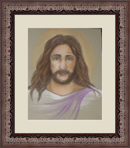
Face #501 is an attempt to paint Christ. This is not my first attempt, and surely not my last. I have an idea for a background to finish the piece.
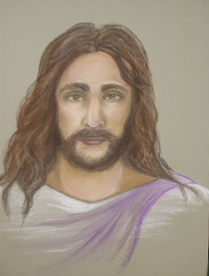
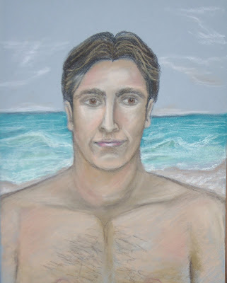
Here is an update for Face #500, putting the character at the beach.
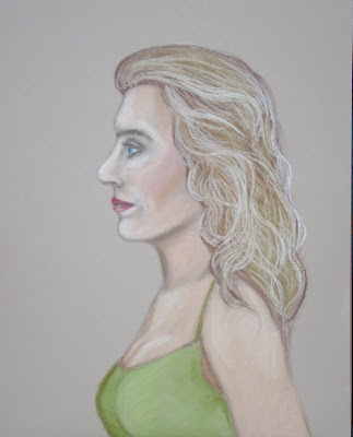
Face #502 will also be "going to the beach"!
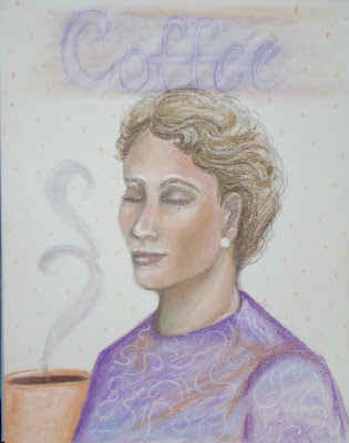
Face #503, more coffee inspired art...
And finally, Face #504 was experimental in the technique I used.
I did all these latest faces over the weekend, not having had an opportunity to work during the week. Hopefully this week I'll get more done. Thanks for visiting! Until next time, take care!
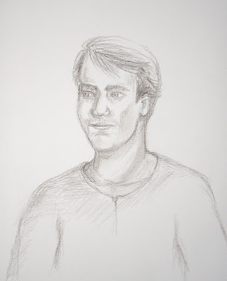