Mission Statement

This is a blog in which I intend to reach my goal to draw/paint a thousand faces! Welcome, and come along for the journey!

Friday, November 30, 2012

Face #735, And An Updated Update

These two faces on the roughly 13" by 13"dark ground (one new, one from last post) are going to get affixed to a larger substrate for some sort of collage type mixed media piece. I may do some other faces to add to it. For now, I wanted to share the newer face.

Also, I went back and updated my update and added the compass and a boat to this piece below. But I may leave the image in my blog header as is for the time being...because who knows? Maybe this updated update will see even more changes. 

I had also toyed with using the arrangement below for my new blog header, but changed my mind ultimately. Seeing different paintings together has given me the idea of making a contact sheet with a collection of about eight pieces I've done that work well together. I'll be sure to share and post a pic of the contact sheet, if I do.

The weather is amazing here right now...just ideal. I hope it holds out for the weekend. Until next time, take care!

Tuesday, November 27, 2012

Dramatic Effect, Face #734

I decided to try out one of my latest Canson Mi-Teints paper acquisitions. I have worked with a dark ground before, so it isn't completely foreign to me to have used this black sheet. A dark ground can be very dramatic, and lend a lot of personality to a piece. I like the boldness of it, as well as the shadowy effects that can be had. This latest piece done on black, while I could have explored it even more, is finished. I do have more of this paper, and there will be more pieces done on dark ground in future posts.

Until next time, take care! And thanks for visiting!

Monday, November 26, 2012

Lighthouse Study, And An Update

I worked on this lighthouse study, 13.5" by 19.5" pastel, yesterday. I think the flash from my camera has the violet looking a bit exaggerated. It's a little more subdued looking in person. But I actually like how it "popped" even more in the photo. The piece is meant to be a companion to the "Florida" poster from last post. 

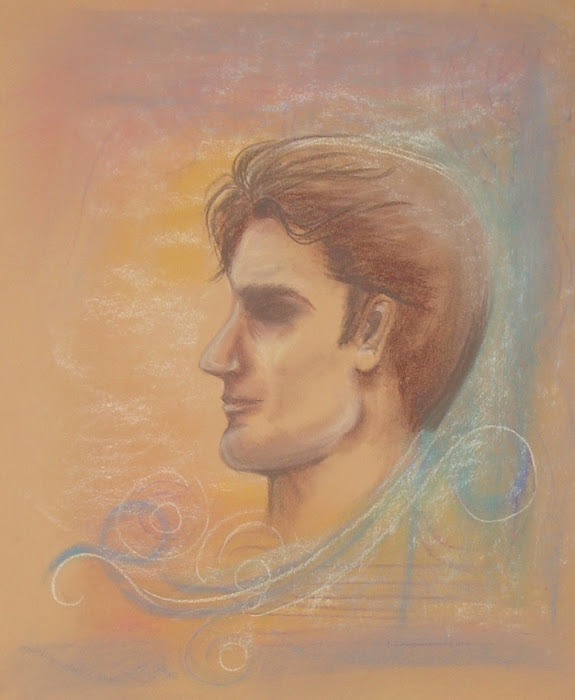
I also went back and updated Face #733 (below), which I felt needed some work. I actually gave it more attention than I was planning to, and he's a whole new man! (chuckle) I think the piece benefitted from sitting for a few days before going back to it. I'm finished with the face, but may or may not do more with the piece. I may add a compass in the image, and try to connect it with the lighthouse and Florida poster I've done. Not sure.


Hope everyone had a good weekend! Until next time, take care!


Saturday, November 24, 2012

"Florida" Poster, And Sea Shells

Although the days here have been in the mild 70's, the nights have gotten really chilly. Certainly too chilly for the beach. Nonetheless, it seems a subject I never tire of artistically rendering. Parts of Florida really are paradise. I started this piece on Wednesday, and didn't finish it until Friday morning after my goodies from my gift certificate arrived. The pastel painting is 13.5" by 15.5", and I show the finished piece as it is first. Then, I show it again after some minor digital work: adding type with a drop shadow; a digital watercolor "salt" effect stroke along the edges for a sandy effect; a drop shadow on the border; all on a sea foam background to complete the poster. One could typically expect nowadays a painting to be converted into an illustration with just such a few digital tweaks. But those tweaks are even chosen carefully so as not to detract, but to add something to an image. You need the right typeface, the right colors, the right overall treatment. The finished poster has a very unmistakable "Florida" feel to it.


Some of the pastels I ordered were in flesh tones, which are also great colors for sea shells. So, I did a fun sea shell study just to acclimate myself with the latest addition of pastels I bought, below.

That was my Friday, on the creative front. I haven't even opened the second half of my shipment from the gift certificate, which is almost all pastel paper. Can't hardly wait!

Hope everyone had a lovely Thanksgiving, and until next time, take care!

Tuesday, November 20, 2012

A New Pastel Study, Face #733

Finally I was able to sit down, tinkering away blissfully and creatively last night with my pastels. Finally after two months of hanging onto a Dick Blick gift certificate for art supplies, I cashed it in today. Perhaps there is some hope for art in my future, after all. I have just been so inundated with paperwork these days, and other things. It's enough to make a person crazy. Does my pastel study below reflect the madness? Probably not. I like the mellowness of the background, though I may tweak the face a bit. I wanted a somewhat non-descript face in this piece, but think I may have to tighten up the detail just a shade more around the eye. Maybe. If I update the piece, I will be sure to post.


(UPDATED, below)

Since I probably won't post again until Friday, I wish you all a Happy Thanksgiving!

Friday, November 16, 2012

In Search Of...

Even when the rare opportunity to do something creative has presented itself lately, the spark hasn't been there. I think my creative spark has been buried beneath a mountain of tedious things needed to be done, and that's why I haven't made anything to post here in over a week. So if you happen to find my muse, send it back to me (laughing). Actually and more seriously, I don't see my schedule lightening up here until after Thanksgiving. But anything I accomplish creatively, I will be sure to post here. I do have a couple of pencil drawings that I went over with ink to show for now. They didn't photograph well because of the reflectiveness of the pencil, but here they are just the same.


I am determined to make some time for some pastel painting over the weekend. Determined. Until next time, take care!

Thursday, November 8, 2012

Green And Gruesome

I happen to think green is a lovely color. Sometimes. I have also seen some "one note" landscape paintings that were ruined by too much of a heavy hand with this color (and even done one like that myself). And let's face it...green and the human body, not very appealing. Nonetheless, I did this detailed figure study below on the last sheet of an aquamarine paper sample. I had originally planned to go with rendering the flesh tones, but got so immersed with the drawing itself and detail that I abandoned my original ideas for the piece. It was a lucrative study, even if in the end he looks somewhat ghastly because of the color. I really further grasped some of the relationships of shapes pertaining to muscle and bone and how they relate to the visible surface of the body. I am really enjoying the further studying of anatomy that I have taken on recently.


It took me less than two minutes to digitally edit the image in a sepia version that is less ghastly!
I have to get on the ball here, and try to get more drawing and painting done. This is all I've done this week, and it hasn't been for lack of time. 

Until next time, take care!

Monday, November 5, 2012

Line Quality, Faces #721-#729

There is no fundamental right or wrong when it comes to line quality in art. In most instances, however, the quality of one type of line may be preferable to another to an artist. Here below in the ink drawing, the lines because they are fine and unblended, tend to be cleaner though not always precise. In a painting such as the one in pastel below, there are actually some blended lines as well as more direct applications of line, but the overall piece is more relaxed in its line quality than an ink drawing. Even with a simple pencil drawing such as in the sketches below, there tends to be combinations of different line qualities rather than just one type. One design book I have read says that the qualities of line are endless, then goes on to give just a few examples such as I have. In truth, there is a lot more to be said about line than whether or not it is precise or relaxed, blended or unblended, delicate or bold, dark or light, straight or curved. The choices as many as there are, can definitely enhance the overall effect in a piece.


I am at the end of the paper samples I purchased, with only the very largest approx. 30" by 40" sheets remaining. This means I have to give more time and thought in the planning for those larger projects. I will still do all my usual sketching and painting, but those larger projects are on the horizon. I hope to share one in the near future, here.

Until next time, thanks for visiting and take care!