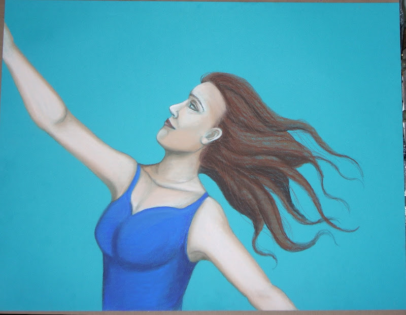
After months had passed, I finally used a gift certificate I had for art supplies last week. I chose to buy a book, some Canson papers, and a few pastels. Canson has the right idea in the naming of their paper, with colors like "Southern Seas", "Hemp", "Oyster". Personally, I tend to ignore more standardized color names realizing they may differ from manufacturer to manufacturer, and re-name them if I am so inclined. I'll call a dark brown, "Espresso" instead of the standard burnt umber. Or I'll just call it dark brown...the one with black added to it. I make up names for my pastels like, "Tortuga Brown", "Drop Dead Red", or "Sharp Cheddar". What can I tell you? It's the source of occasional amusement for me, and my relationship with color is more intuitive, raw and visceral than it is refined. I bought ten sheets 19" by 25" of the "Southern Seas" by Canson, thinking I'd use them for non-face related artwork. Maybe some abstract designs with shells and such. But as I sat looking at the first sheet, inevitably a face was drawn. I can't decide if she is falling, flying, reaching or in the middle of a tango being dipped! And it's my intention to leave it that way, where it could be displayed from multiple orientations. The background to be added will not include anything to indicate up from down. It is a study in the sense that I know it should look "right" no matter the orientation.


 I also thought I'd post a tentative update of the angel I was working on. I brought the photo of it into Corel Painter and think this is the direction I am heading with it, below.
 Well, that's my weekend post. I will try to post again by Tuesday! Until next time, take care!
